Introducing Chart View: Visualize Data & Gain Insights at a Glance
Tired of sorting through endless lists to understand how your projects are coming along?
Plaky's Chart view instantly transforms your board data into clear, interactive visuals, making it easy to grasp how your work is organized and progressing.
Ready to get a real bird's-eye overview? Let's go through all the details.
About Chart view
Plaky’s Chart view helps you visualize your projects and tasks using dynamic, interactive charts.
This feature is perfect for organizing your work by specific Fields, such as Status, Team Member, and Tag, and even Groups, allowing you to instantly compare data and see where things stand.
There are 2 chart types for your visualization needs: pie and bar charts.
→ Key benefit
Charts transform your data into clear insights, helping you quickly see progress, spot issues, and make smarter decisions backed up by data that everyone can understand.
Creating your first Chart view
Adding a new Chart view to any of your boards is pretty straightforward.
Here’s how to create one:
- Open your Board.
- Click the gear icon located next to your existing views.
- Select Create new view.
- Choose the view type.
- Select Chart.
- Enter a clear view name (e.g., "Team Progress Chart").
- Click Create.
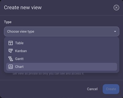
Your new chart will instantly appear with the settings menu open, ready for customization.
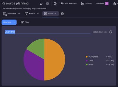
By default, it will be a pie chart titled "Chart title." You can easily change those details.
Pie vs. bar charts
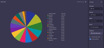
The pie chart shows your projects and tasks, grouped by fields like Status, Tag, Person — or even by Group — and divided into colorful slices. Each slice illustrates a portion of your total data, with its size indicating its proportion to the whole.
You can group the pie chart by:
- Status — See the proportion of tasks in different stages, like "To do," "In progress," or "Done."
- Tag — Visualize the percentage of items related to specific categories (e.g., "Marketing," "Development," "Client feedback").
- Person — Understand task distribution among individual team members.
- Group — See the proportion of items belonging to different board groups (e.g., "Backlog," "Current Sprint").
On the right side of the chart, a legend provides details for each slice: its label, total value (number of items/subitems), and the percentage it contributes to the entire “pie”.
When you hover over a slice, it will gently highlight and enlarge, and a tooltip will appear with its name, total count, and percentage.
By default, if your board includes Status, Person, or Tag fields, your pie chart will prioritize grouping by Status, then Person, and then Tag. If none of these fields exist, the chart will default to grouping by "Item Creator."
Example: An IT department could use a pie chart to visualize their work ticket distribution by Status, instantly grasping how many tickets are 'Open,' 'In progress,' or 'Resolved'.
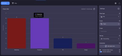
In comparison, the bar chart presents your tasks and subtasks grouped by Custom Fields, displayed as distinct columns (bars).
The data is organized using X and Y axes. The X-axis lists all your chosen fields, while the Y-axis counts the total number of items within each field.
For the X-axis, you can choose:
- Status — See how many items are in "To do," "In progress," "Done," or "Stuck" stages.
- Person — Visualize the number of tasks assigned to each team member.
- Tag — Count items associated with different categories, like "Marketing," "Development," or "Urgent."
- Group — Compare the number of items within different board groups.
- Priority — Show how many items are "High," "Medium," or "Low" priority.
When you hover over a bar, the bar will brighten, and a tooltip will appear above it, showing the group name, total count (e.g., Count: 10), and percentage (e.g., 40%).
When you switch from a pie to a bar chart, the bar chart's X-axis will automatically use the same grouping you had, keeping your view consistent.
Example: A marketing team could use a bar chart to compare campaign tasks grouped by Team Member to see how many tasks each person has. Alternatively, they could group the tasks by Tag to understand the distribution of different campaign types.
Customizing your view with chart settings
You have extensive control over the Chart view’s appearance and data representation using the Settings panel located on the right side of your chart.
Let's explore the key settings you can adjust.
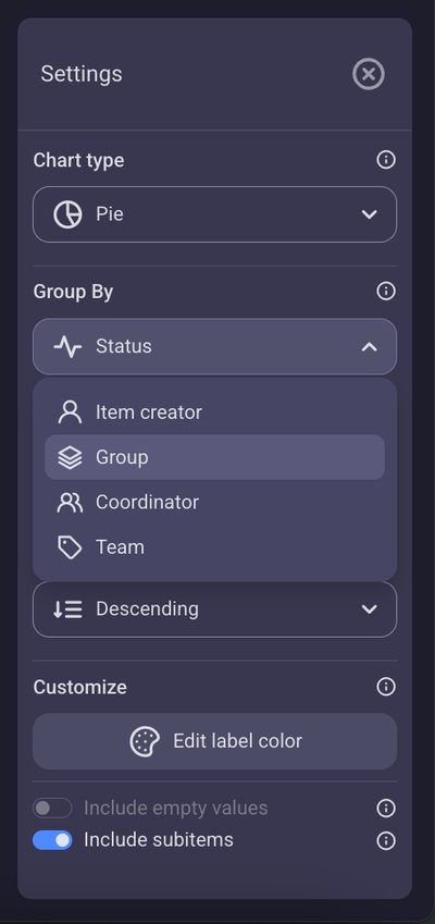
Group chart data
Charts help you visualize your data by organizing your items and subitems based on different categories. You can group your data by:
- Item Creator — See how many items each team member has created.
- Group — Understand the number of items within each board group (like "Marketing" or "Engineering").
- Status — View items based on their status labels (e.g., "To do," "In progress," "Done").
- Person — Count items assigned to specific team members.
- Tag — Group items by their assigned tags. The way you select your grouping depends on your chart type. For pie charts, use the "Group by" dropdown menu. For bar charts, use the "X-axis" dropdown menu. If you switch from a pie to a bar chart, your grouping will automatically carry over. For instance, if your pie chart was grouped by "Status," your bar chart's X-axis will also show data by "Status."
- Sort by — Arrange your chart values in either ascending or descending order. By default, values are sorted in a descending order.
- Edit label color — While charts inherit default label colors, you have the flexibility to customize individual label colors directly from here.
- Include empty values — This toggle (off by default) allows you to show or hide items with no relevant data. For example, when grouping by "Person," turning this option on will display a slice or bar representing unassigned tasks.
- Include subitems — This toggle (on by default) lets you include or exclude subitems in your counts. Activating it provides a total workload view, combining both main tasks and their subtasks.
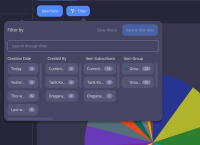
Apply filters
Easily pinpoint the exact information you need in your chart by applying filters. Just click the Filter button, choose your criteria (like "Creation date" or "Item group"), and click Save in this view.
Filters will apply automatically to subitems as well.
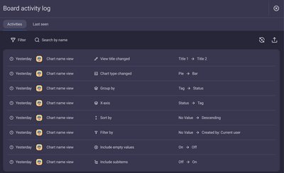
Refresh and Activity log
Your chart refreshes automatically every 15 minutes or when the Board changes.
You can also manually refresh it anytime, with all setup, filter, sort, and title adjustments recorded in the Activity log.
FAQ
Who can create charts in Plaky?
Board Owners and Board Members with "Edit everything" permissions can create public charts for everyone, while Board Members with the "Edit content" permission can create private charts just for themselves.
Viewers cannot create charts.
How can I use charts in my everyday work?
Charts cover many use cases, helping you:
- Understand progress — See where tasks stand (To do vs. Done).
- Spot trends — Identify overwhelmed team members or common issues.
- Make data-driven decisions — Guide planning and resource allocation.
- Communicate clearly — Share engaging visual summaries.
How can I tell if my charts are working, or what they've done?
Check the Activity log on your Board or individual Items. It records when chart configurations are changed, filters are applied, or sorting is updated.